Free Communication Templates
Email newsletters are still one of the most powerful tools for building relationships with your organization’s volunteers. Yet regrettably, volunteer newsletters are often an afterthought within volunteer organizations.
Volunteer programs are occupied with meeting critical community needs, and many lack the time to invest in their volunteer newsletter. When organizations send hurried newsletters (or don’t send one at all), they’re missing an opportunity to to engage with their volunteers.
The good news? By fixing these 5 common newsletter mistakes, you can turn around an under-preforming newsletter and more effectively engage and connect with your subscribers!
Let’s get started.
Mistake #1: Your timing and frequency are off
Volunteer leaders can develop rapport and build volunteer relationships when they send consistent volunteer communications. Every time a volunteer opens your newsletter, they learn more about your organization’s personality and mission, and become more invested in your cause.
For many organizations, newsletter timing is their #1 struggle. This might look like:
- Sending too few emails
- Sending infrequent or sporadic emails
- Sending too many emails
Lack of time and resources are the biggest obstacles in sending a consistent volunteer newsletter. When you don’t communicate consistently, your volunteers don’t get enough information about your program, its needs, and the ways they can contribute. They may eventually lose interest altogether and disengage from your cause.
On the other hand, some programs may bombard their volunteers with too many email updates. This is a surefire way to cause volunteers to disengage with you, or worse–unsubscribe.
So, how do you strike the right balance between staying in touch and becoming a nuisance?
While this varies based on your audience and industry, we generally suggest sending at least one newsletter per month. If you can send two, that’s even better.
If this seems like a lot of work, remember: quality is better than quantity. Focus on sending one solid newsletter update on a regular, recurring basis, even if it's short and sweet. This will help your organization stay on top of your volunteers’ mind (and inbox)!
Mistake #2: Design Struggles
It doesn’t matter how good your writing is or how interesting your stories are…if you neglect the design of your volunteer newsletter, you can expect decreased engagement with its contents.
A poorly-designed newsletter not only makes it difficult for your volunteers to connect with the content, but it also makes your organization seem less credible.
Luckily, a few simple tweaks can turn a visually unappealing newsletter into a polished cornerstone of your volunteer communication strategy. Here are some of the biggest design-related errors to watch out for:
- Distracting fonts and colors.
Small, overly-stylized, and colored fonts are hard to read–especially on screens. This is one of the quickest ways to make your readers disengage from your newsletter content. Review your newsletter and make sure you’re choosing legible fonts and color schemes that support readability.
Pro tip: Create a template that you reuse for every newsletter. This will help keep things consistent and neat from send-to-send and it will decrease staff time. It’s a win-win! - Not mobile-optimized.
We all know that our content should be mobile-optimized, but many volunteer programs don’t put this knowledge into action. As a result, they’re sending out volunteer newsletters that either don’t load or don’t display correctly on mobile devices. This can lead to navigation and readability issues for your volunteers, which can impact your unsubscribe rate. Double check that your newsletter template automatically responds to different screen sizes so that you don’t lose your subscribers. -
Images are too large or numerous.
You should absolutely include images in your newsletter; these are some of the most engaging parts of your correspondence! However, you should make sure that your images aren’t hurting your newsletter’s performance. Oversized images cause slow loading times, which may prompt your readers to exit the email before it’s finished loading. Most marketers recommend keeping newsletter images around 600px wide so that they’re optimized for the web. Also, make sure you also don’t visually overwhelm your reader with images by striking a balance between text and visual components.
Mistake #3: Unclear Calls to Action or Not Using a CTA at All!
A common volunteer newsletter mistake is vague or absent CTAs. If you’re not including strong CTAs, you’re missing opportunities for volunteer engagement and program growth.
How do you find the right CTA for your newsletter?
When you’re drafting your monthly volunteer newsletter, you should have an end-goal in mind. Your goal might be to get more volunteer opportunity sign ups on your volunteer management software, to raise donations, or to create awareness of an upcoming event. You can then encourage your volunteers to take a desired action by including clear, enticing calls to action in your volunteer newsletter.
Keep these quick tips in mind so that you write a winning CTA in your next newsletter:
- Make the CTA stand out visually
- Use action words
- Align your CTA with the content’s purpose
- Make the CTA easy to complete
- Keep it short and to the point
- Use color to draw attention to the CTA
Need some CTA inspiration?
Try one of these clear and concise CTAs in your next newsletter:
- Yes, sign me up!
- Donate Now
- Read Yosef’s story
- Register Today
Mistake #4: Not Personal or Relevant Enough to Your Volunteers
Your volunteers are looking for curated, interesting content that resonates with their interests and needs. One of the quickest ways for them to feel unseen is by sending irrelevant, impersonal content.
Embrace personalization by collecting relevant volunteer data in your volunteer management software. Then, segment your email list and curate your content based on these data points. For instance, you might want to send different newsletters to your unengaged vs. recurring volunteers.
Volunteer data can help curate your language and Calls to Action to be more personalized and specific to your audience.
Personalize your volunteer newsletter in the following ways:
- Address your readers by name or title
- Include volunteer opportunities based on their preferred causes and interests
- Send your newsletter according to the timezone of your recipient
- Share volunteer impact or community stories
Mistake #5: Not Tracking Newsletter Analytics
If you’re sending a volunteer newsletter without really tracking its performance, you’re not alone. But these results contain a wealth of information that can help fine-tune your newsletter strategy and boost engagement.
Email analytics provide insight into your volunteers preferences, and can also help you troubleshoot and identify underperforming sections of your newsletter. Here are some possible interpretations for your newsletter analytics:
- Low click through rate. Your CTAs were unclear, confusing, or not convincing. Your content did not pique enough interest for a click through.
- Low open rate. Your subject line and preview text did not resonate with the audience. Your send time was too early or too late in the day. Your audience does not recognize your organization’s email address.
- High unsubscribe rate. Your content is not relevant or personal enough to your audience. You did not properly gain permission to email the subscribers. You’re sending your newsletter too frequently.
- Spam reports. Your newsletter design looked spammy or unprofessional. You don’t send often enough for brand recognition.
By keeping a close eye on your email results, you’ll learn what works and what doesn’t for your unique audience. Use this knowledge to tweak your newsletter and increase your effectiveness over time.
What to Include in a Volunteer Newsletter
Now that you know what not to do in your volunteer newsletter, let’s cover some of the key elements you should include:
- Volunteer Spotlights. Dedicate a section of your newsletter to spotlight individual volunteers or corporate teams. This is a great place to share their stories, experiences, or what made them stand out this month. Regularly recognizing volunteers for their efforts boosts morale and volunteer engagement!
- Upcoming Volunteer Opportunities and Events. Keep volunteers in-the-know by sharing upcoming volunteer opportunities and events! Make sure to include a strong CTA that links to your volunteer sign up page. You can also use this section to encourage volunteers to share the opportunity in their own networks.
- Program News. Volunteers want to stay informed about what’s happening in your organization! Share information about your program’s progress, impact, and achievements. This helps keep your readers connected with your mission and cause.
- New Blog Articles. Does your program have a blog? If so, drive your newsletter subscribers to your website by linking to your newest blog post. This will also positively impact your website’s SEO, and can help showcase another aspect of your organization that’s not present in your newsletter.
- Feedback and Surveys. Volunteer surveys are one of the best ways to get to know your volunteers. Ask your volunteers to share their feedback and suggestions for program improvements. This can help you more carefully segment volunteers, identify areas for growth, and gauge volunteer satisfaction.
Best Examples of E-Newsletters for Your Volunteer Program
Finally, let’s explore some of the top volunteer newsletter examples that harness effective communication strategies to engage supporters and advance their mission:
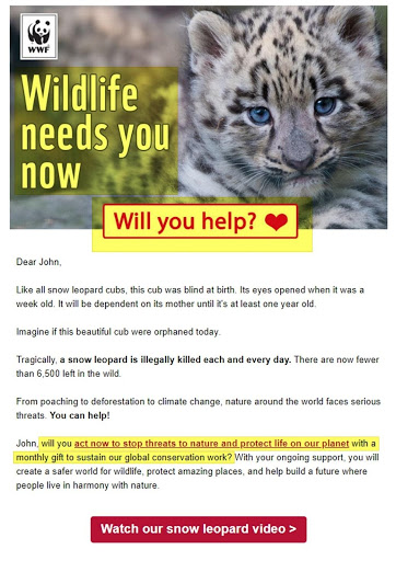
The World Wildlife Fund
The WWF’s newsletter makes use of strong CTAs and strategic color choices to encourage their subscribers to take action.Oxfam International
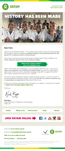
Oxfam’s newsletter is great because it’s visually appealing while also sharing the impact of their donors and volunteers.
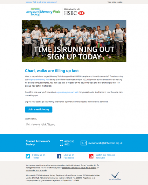
Alzheimer’s Society
We like the Alzheimer’s Society’s newsletter because it very clearly and concisely invited readers to get involved, and explained multiple ways for them to do so. Additionally, it has listed several ways for volunteers to further connect with them outside of the email.
Newsletters are more than just emails; they tell your organization’s story. When done well, newsletters have the potential to inform, inspire, and engage your volunteer force.
Make sure that your effort doesn’t go to waste by watching out for these 5 common newsletter mistakes and incorporating the elements you need to drive volunteer engagement.


